T3chfest slides or how I'm the worst
So… after 1 month I’m publishing the slides for my t3chfest talk (please comment any doubts on the slides) and the video.
I had too many things I wanted to mention, blew the time (and I thought I had 10 minutes more) and didn’t do a dry run of the talk before. Feedback was good-ish.
I didn’t had time to mention the 3 slides with references so at least I wanted to point out the best ones:
- The Truthful Art (@albertocairo, blog, book)
- Storytelling with Data (@storywithdata, blog, book)
- informationisbeautiful (blog)
- thewhyaxis (blog)
- policyviz.com (podcast)
- Talk & talk & talk (youtube.com)
- Miami Course (dropbox.com)
I’ve been living in a haze this last 3 months and I’m completely not up-to-date on commitments. Sorry :’(
As a final compensation of taking so long… here are some interesting tidbits I should have tweeted after the talk…
- A very good graph from the BBC:
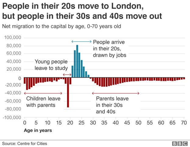
It illustrates quite well one of the things I wanted to point out in the talk, that the graph transmits a message/tells a story.
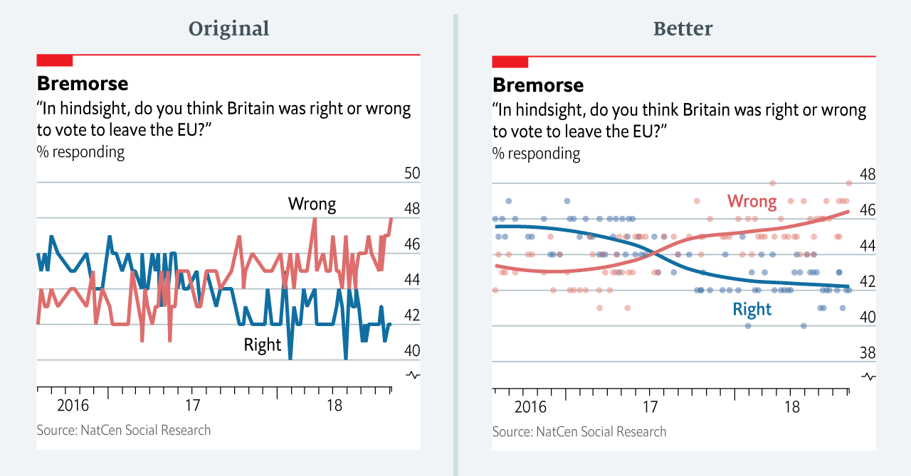
- This compedium of mistakes from theeconomist
-
The FT visual vocabulary, to help you choose the best visualization.
-
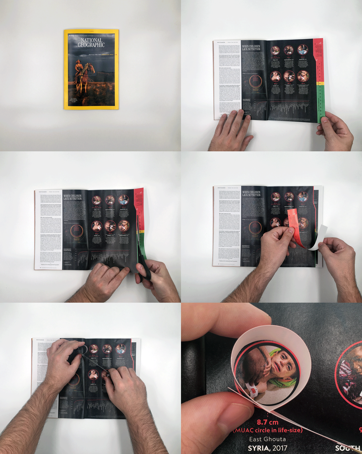
And please, please, please take a look at the winner of the Best of Show award at Malofiej

Sorry for the delay, see you around at: http://lechazoconf.com
